The Life-Changing Power of Color Psychology
One of the biggest disconnects I’ve come across in the design world is the complex relationship between color and our psyche.
Most people choose a paint color based on what they like or on what’s currently trendy. The psychological aspect of color is usually a distant second thought.
But as a Conscious Designer, this just seems straight-up crazy to me!
We’re ultimately creating the environment that we spend most of our time in and we are always affected by the colors around us, even in very subtle ways. Why would you ever want to choose a color that makes you feel depressed or lethargic?
So while your preferences and current design trends are also important, we should also give careful consideration to the power of Color Psychology: how our chosen color truly makes us feel.
The Power of Color Psychology
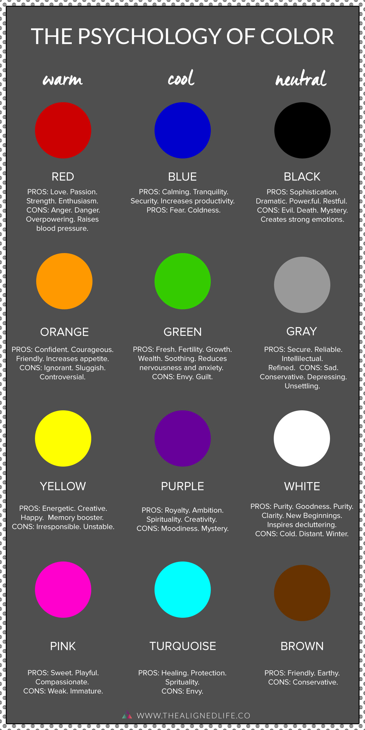
For example, gray is a trendy color right now. But using too much of it can seem drab or depressing. And I’m not saying you need to avoid it entirely! But be sure to balance it out with some bright colors that are highly associated with your desired states.
All of that said, color is a highly personal thing; we are also influenced by the role color has played in our past. So a color might seem wrong according to this chart but maybe it reminds you of a happy memory. Then it’s still a great choice!
Getting clear on the reasons why you like a certain color can reveal a lot about our inner self.
If a certain shade really speaks to you, then follow your heart and put it on your walls!
Ultimately it’s up to you to make the best decision for your own unique personality and desires.
I hope this has inspired you to think about color from a fresh new perspective. Let me know how it goes!

Did you find this post useful or inspiring? Save this pin to your Interior Design board on Pinterest!

I'm a hypnotist, healer, and coach who's here to reprogram you to reach your full magic & potential.
98% of people will die without realizing their dreams. I'm here to change that.
Every year I help millions of readers manifest their dream reality. Are you the next one who will find success?
You were born wildly deserving of your dream life! You just need to reprogram your blocks and get your subconscious mind onboard with what you want.
Let's go!
- Seeing 222 Everywhere? The Meaning of Angel Number 222 - April 16, 2024
- 10+ Spiritual Shows To Watch On Netflix - April 9, 2024
- Sacral Authority Type | Human Design Explained - April 8, 2024